Generating Climate Temperature Spirals in Python
Ed Hawkins, a climate scientist, tweeted the following animated visualization in 2017 and captivated the world:
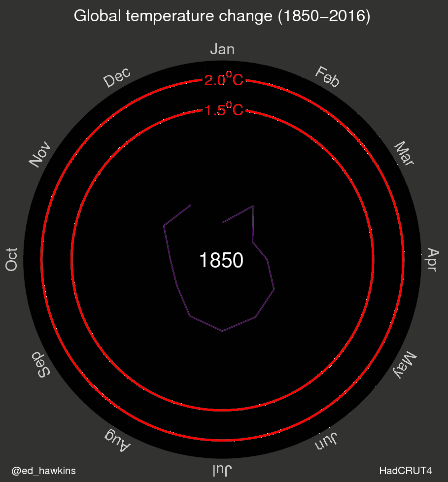
This visualization shows the deviations from the average temperature between 1850 and 1900. It was reshared millions of times over Twitter and Facebook and a version of it was even shown at the opening ceremony for the Rio Olympics. The visualization is compelling, because it helps viewers understand both the varying fluctuations in temperatures, and the sharp overall increases in average temperatures in the last 30 years. You can read more about the motivation behind this visualization on Ed Hawkins' website. In this blog post, we'll walk through how to recreate this animated visualization in Python. We'll specifically be working with pandas (for representing and munging the data) and matplotlib (for visualizing the data). If you're unfamiliar with matplotlib, we recommend going through the Exploratory Data Visualization and Storytelling Through Data Visualization courses. We'll use the following libraries in this post:
- Python 3.6
- Pandas 0.22
- Matplotlib 2.2.2
Data cleaning
The underlying data was released by the Met Office in the United Kingdon, which does excellent work on weather and climate forecasting. The dataset can be downloaded directly
here. The openclimatedata repo on Github contains some helpful data-cleaning code in this notebook. You'll need to scroll down to the section titled Global Temperatures. The following code reads the text file into a pandas data frame:
hadcrut = pd.read_csv(
    "HadCRUT.4.5.0.0.monthly_ns_avg.txt",
    delim_whitespace=True,
    usecols=[0, 1],
    header=None)
Then, we need to:
- split the first column into
monthandyearcolumns - rename the
1column tovalue - select and save all but the first column (
0)
hadcrut['year'] = hadcrut.iloc[:, 0].apply(lambda x: x.split("/")[0]).astype(int)
hadcrut['month'] = hadcrut.iloc[:, 0].apply(lambda x: x.split("/")[1]).astype(int)
hadcrut = hadcrut.rename(columns={1: "value"})hadcrut = hadcrut.iloc[:, 1:]
hadcrut.head()| value | year | month | |
|---|---|---|---|
| 0 | -0.700 | 1850 | 1 |
| 1 | -0.286 | 1850 | 2 |
| 2 | -0.732 | 1850 | 3 |
| 3 | -0.563 | 1850 | 4 |
| 4 | -0.327 | 1850 | 5 |
To keep our data
tidy, let's remove rows containing data from 2018 (since it's the only year with data on 3 months, not all 12 months).
hadcrut = hadcrut.drop(hadcrut[hadcrut['year'] == 2018].index)Lastly, let's compute the mean of the global temperatures from 1850 to 1900 and subtract that value from the entire dataset. To make this easier, we'll create a
multiindex using the year and month columns:
hadcrut = hadcrut.set_index(['year', 'month'])This way, we are only modifying values in the
value column (the actual temperature values). Finally, calculate and subtract the mean temperature from 1850 to 1900 and reset the index back to the way it was before.
hadcrut -= hadcrut.loc[1850:1900].mean()
hadcrut = hadcrut.reset_index()
hadcrut.head()| year | month | value | |
|---|---|---|---|
| 0 | 1850 | 1 | -0.386559 |
| 1 | 1850 | 2 | 0.027441 |
| 2 | 1850 | 3 | -0.418559 |
| 3 | 1850 | 4 | -0.249559 |
| 4 | 1850 | 5 | -0.013559 |
Cartesian versus polar coordinate system
There are a few key phases to recreating Ed's GIF:
- learning how to plot on a polar cooridnate system
- transforming the data for polar visualization
- customizing the aesthetics of the plot
- stepping through the visualization year-by-year and turning the plot into a GIF
We'll start by diving into plotting in a
polar coordinate system. Most of the plots you've probably seen (bar plots, box plots, scatter plots, etc.) live in the cartesian coordinate system. In this system:
xandy(andz) can range from negative infinity to positive infinity (if we're sticking with real numbers)- the center coordinate is (0,0)
- we can think of this system as being rectangular
 In contrast, the polar coordinate system is circular and uses
 r and theta. The r coordinate specifies the distance from the center and can range from 0 to infinity. The theta coordinate specifies the angle from the origin and can range from 0 to 2*pi.  To learn more about the polar coordinate system, I suggest diving into the following links:
Preparing data for polar plotting
Let's first understand how the data was plotted in Ed Hawkins' original climate spirals plot. The temperature values for a single year span almost an entire spiral / circle. You'll notice how the line spans from January to December but doesn't connect to January again. Here's just the 1850 frame from the GIF:
 This means that we need to subset the data by year and use the following coordinates:
r: temperature value for a given month, adjusted to contain no negative values.- Matplotlib supports plotting negative values, but not in the way you think. We want -0.1 to be closer to the center than 0.1, which isn't the default matplotlib behavior.
- We also want to leave some space around the origin of the plot for displaying the year as text.
theta: generate 12 equally spaced angle values that span from 0 to 2*pi.
Let's dive into how to plot just the data for the year 1850 in matplotlib, then scale up to all years. If you're unfamiliar with creating Figure and Axes objects in matplotlib, I recommend our
Exploratory Data Visualization course. To generate a matplotlib Axes object that uses the polar system, we need to set the projection parameter to "polar" when creating it.
fig = plt.figure(figsize=(8,8))
ax1 = plt.subplot(111, projection='polar')
Here's what the default polar plot looks like:
 To adjust the data to contain no negative temperature values, we need to first calculate the minimum temperature value:
hadcrut['value'].min()-0.66055882352941175Let's add
1 to all temperature values, so they'll be positive but there's still some space reserved around the origin for displaying text:

Let's also generate 12 evenly spaced values from 0 to 2*pi and use the first 12 as the theta values:
import numpy as np
hc_1850 = hadcrut[hadcrut['year'] == 1850]
fig = plt.figure(figsize=(8,8))
ax1 = plt.subplot(111, projection='polar')
r = hc_1850['value'] + 1
theta = np.linspace(0, 2*np.pi, 12)
To plot data on a polar projection, we still use the
Axes.plot() method but now the first value corresponds to the list of theta values and the second value corresponds to the list of r values.
ax1.plot(theta, r)Here's what this plot looks like:

Tweaking the aesthetics
To make our plot close to Ed Hawkins', let's tweak the aesthetics. Most of the other matplotlib methods we're used to having when plotting normally on a cartesian coordinate system carry over. Internally, matplotlib considers
theta to be x and r to be y. To see this in action, we can hide all of the tick labels for both axes using:
ax1.axes.get_yaxis().set_ticklabels([])
ax1.axes.get_xaxis().set_ticklabels([])
Now, let's tweak the colors. We need the background color within the polar plot to be black, and the color surrounding the polar plot to be gray. We actually used an image editing tool to find the exact black and gray color values, as
- Gray: #323331
- Black: #000100
We can use
fig.set_facecolor() to set the foreground color and Axes.set_axis_bgcolor() to set the background color of the plot:
fig.set_facecolor("#323331")
ax1.set_axis_bgcolor('#000100')
Next, let's add the title using
Axes.set_title():
ax1.set_title("Global Temperature Change (1850-2017)", color='white', fontdict={'fontsize': 30})Lastly, let's add the text in the center that specifies the current year that's being visualized. We want this text to be at the origin
(0,0), we want the text to be white, have a large font size, and be horizontally center-aligned.
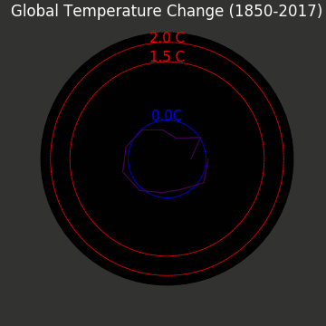
ax1.text(0,0,"1850", color='white', size=30, ha='center')Here's what the plot looks like now (recall that this is just for the year 1850).

Plotting the remaining years
To plot the spirals for the remaining years, we need to repeat what we just did but for all of the years in the dataset. The one tweak we should make here is to manually set the axis limit for
r (or y in matplotlib). This is because matplotlib scales the size of the plot automatically based on the data that's used. This is why, in the last step, we observed that the data for just 1850 was displayed at the edge of the plotting area. Let's calculate the maximum temperature value in the entire dataset and add a generous amount of padding (to match what Ed did).
hadcrut['value'].max()1.4244411764705882We can manually set the y-axis limit using
Axes.set_ylim()
ax1.set_ylim(0, 3.25)Now, we can use a for loop to generate the rest of the data. Let's leave out the code that generates the center text for now (otherwise each year will generate text at the same point and it'll be very messy):
fig = plt.figure(figsize=(14,14))
ax1 = plt.subplot(111, projection='polar')

ax1.axes.get_yaxis().set_ticklabels([])
ax1.axes.get_xaxis().set_ticklabels([])
fig.set_facecolor("#323331")
ax1.set_ylim(0, 3.25)

theta = np.linspace(0, 2*np.pi, 12)

ax1.set_title("Global Temperature Change (1850-2017)", color='white', fontdict={'fontsize': 20})
ax1.set_axis_bgcolor('#000100')

years = hadcrut['year'].unique()

for year in years:
    r = hadcrut[hadcrut['year'] == year]['value'] + 1
     # ax1.text(0,0, str(year), color='white', size=30, ha='center')
    ax1.plot(theta, r)
Here's what that plot looks like:

Customizing the colors
Right now, the colors feel a bit random and don't correspond to the gradual heating of the climate that the original visualization conveys well. In the original visualiation, the colors transition from blue / purple, to green, to yellow.
This color scheme is known as a sequential colormap, because the progression of colors reflects some meaning from the data. While it's easy to specify a color map when creating a scatter plot in matplotlib (using the cm parameter from Axes.scatter(), there's no direct parameter to specify a colormap when creating a line plot. Tony Yu has an excellent short post on how to use a colormap when generating scatter plots, which we'll use here. Essentially, we use the color (or c) parameter when calling the Axes.plot() method and draw colors from plt.cm.<colormap_name>(index). Here's how we'd use the viridis colormap:
ax1.plot(theta, r, c=plt.cm.viridis(index)) # Index is a counter variableThis will result in the plot having sequential colors from blue to green, but to get to yellow we can actually multiply the counter variable by
2:
ax1.plot(theta, r, c=plt.cm.viridis(index*2))Let's reformat our code to incorporate this sequential colormap.
fig = plt.figure(figsize=(14,14))
ax1 = plt.subplot(111, projection='polar')

ax1.axes.get_yaxis().set_ticklabels([])
ax1.axes.get_xaxis().set_ticklabels([])
fig.set_facecolor("#323331")

for index, year in enumerate(years):
    r = hadcrut[hadcrut['year'] == year]['value'] + 1
    theta = np.linspace(0, 2*np.pi, 12)

    ax1.grid(False)
    ax1.set_title("Global Temperature Change (1850-2017)", color='white', fontdict={'fontsize': 20})

    ax1.set_ylim(0, 3.25)
    ax1.set_axis_bgcolor('#000100')
     # ax1.text(0,0, str(year), color='white', size=30, ha='center')
    ax1.plot(theta, r, c=plt.cm.viridis(index*2))
Here's what the resulting plot looks like:

Adding temperature rings
While the plot we have right now is pretty, a viewer can't actually understand the underlying data at all. There's no indication of the underlying temperature values anywhere in the visulaization. The original visualization had full, uniform rings at 0.0, 1.5, and 2.0 degrees Celsius to help with this. Because we added
1 to every temperature value, we need to do the same thing here when plotting these uniform rings as well. The blue ring was originally at 0.0 degrees Celsius, so we need to generate a ring where r=1. The first red ring was originally at 1.5, so we need to plot it at 2.5. The last one at 2.0, so that needs to be 3.0.
full_circle_thetas = np.linspace(0, 2*np.pi, 1000)
blue_line_one_radii = [1.0]*1000
red_line_one_radii = [2.5]*1000
red_line_two_radii = [3.0]*1000

ax1.plot(full_circle_thetas, blue_line_one_radii, c='blue')
ax1.plot(full_circle_thetas, red_line_one_radii, c='red')
ax1.plot(full_circle_thetas, red_line_two_radii, c='red')
Lastly, we can add the text specifying the ring's temperature values. All 3 of these text values are at the 0.5*pi angle, at varying distance values:
ax1.text(np.pi/2, 1.0, "0.0 C", color="blue", ha='center', fontdict={'fontsize': 20})
ax1.text(np.pi/2, 2.5, "1.5 C", color="red", ha='center', fontdict={'fontsize': 20})
ax1.text(np.pi/2, 3.0, "2.0 C", color="red", ha='center', fontdict={'fontsize': 20})
Because the text for "0.5 C" gets obscured by the data, we may want to consider hiding it for the static plot version.
Generating The GIF Animation
Now we're ready to generate a GIF animation from the plot. An animation is a series of images that are displayed in rapid succession. We'll use the
matplotlib.animation.FuncAnimation function to help us with this. To take advantage of this function, we need to write code that:
- defines the base plot appearance and properties
- updates the plot between each frames with new data
We'll use the following required parameters when calling
FuncAnimation():
fig: the matplotlib Figure objectfunc: the update function that's called between each frameframes: the number of frames (we want one for each year)interval: the numer of milliseconds each frame is displayed (there are 1000 milliseconds in a second)
This function will return a
matplotlib.animation.FuncAnimation object, which has a save() method we can use to write the animation to a GIF file. Here's some skeleton code that reflects the workflow we'll use:
# To be able to write out the animation as a GIF file
import sysfrom matplotlib.animation import FuncAnimation
# Create the base plot
fig = plt.figure(figsize=(8,8))
ax1 = plt.subplot(111, projection='polar')
def update(i):
    # Specify how we want the plot to change in each frame.
    # We need to unravel the for loop we had earlier.
    year = years[i]
    r = hadcrut[hadcrut['year'] == year]['value'] + 1
    ax1.plot(theta, r, c=plt.cm.viridis(i*2))
    return ax1

anim = FuncAnimation(fig, update, frames=len(years), interval=50)

anim.save('climate_spiral.gif', dpi=120, writer='imagemagick', savefig_kwargs={'facecolor': '#323331'})
All that's left now is to re-format our previous code and add it to the skeleton above. We encourage you to do this on your own, to practice programming using matplotlib.
Here's what the final animation looks like in lower resolution (to decrease loading time).
Next Steps
In this post, we explored:
- how to plot on a polar coordinate system
- how to customize text in a polar plot
- how to generate GIF animations by interpolating multiple plots
You're able to get most of the way to recreating the excellent climate spiral GIF Ed Hawkins originally released. Here are the few key things that are that we didn't explore, but we strongly encourage you to do so on your own:
- Adding month values to the outer rim of the polar plot/
- Adding the current year value in the center of the plot as the animation is created.
- If you try to do this using the
FuncAcnimation()method, you'll notice that the year values are stacked on top of each other (instead of clearing out the previous year value and displaying a new year value).
- If you try to do this using the
- Adding a text signature to the bottom left and bottom right corners of the figure.
- Tweaking how the text for 0.0 C, 1.5 C, and 2.0 C intersect the static temperature rings.