Choosing the Right Chart for Your Data
We see data visualizations everywhere: reports, presentations, social media, and even the news. Yet have you ever seen a chart that just didn’t make sense? Despite how common they are, choosing the right chart isn’t always intuitive. The key is to start by clearly identifying the question you want to answer.
In this tutorial, we'll teach you how to choose the best visualization to answer your data questions. By the end, you'll have the confidence and clarity needed to select effective charts that communicate your insights clearly and persuasively. To practice these skills with real datasets and build production-ready visualizations, explore our data visualization courses.

Why Choosing the Right Chart Starts with Your Question
We’ll be using transaction data from a fictional retail business, “Superstore,” which sells furniture and electronics. While the data isn’t real, it reflects common business scenarios, making it a useful learning tool. The process of choosing the right visualization remains the same whether we’re working with real company data or a practice dataset.
But before we can create an effective visualization, we need to define what we’re trying to understand. Otherwise, even a well-designed chart can lead to misleading conclusions.
Imagine we have data on discount percentages and profits. Without a clear question, we might pick a chart at random—say, a pie chart—and end up with a confusing visual. Pie charts show parts of a whole, not relationships between numeric variables.
Instead, if we ask “How do discount percentages affect profit?” we see that we’re looking for a relationship between two numbers. A scatter plot becomes the obvious choice, revealing whether higher discounts lead to lower profits.
Starting with a clear question ensures that your chart choice aligns with your goal, making it easier for your audience to grasp the insights you want to share.
Matching Your Question to the Right Chart
Now, we'll break down seven common chart types one by one, focusing on the questions they answer best.
1. Bar Charts: Comparing Categories

When our data question is about comparing discrete categories (distinct groups or types, such as different products, regions, or departments), a bar chart is often the best choice. Because each bar’s length is directly comparable, bar charts make it easy to see which categories are larger or smaller at a glance, highlighting differences in magnitude.
Answer questions like:
❔ How do different [categories] compare in terms of [measurement]?
Superstore Example:
We want to show which products generated the highest sales at Superstore. A bar chart clearly compares total sales across different products, immediately highlighting the standout performers, like the Nokia Smart Phone or Novimex executive leather armchair.
✅ 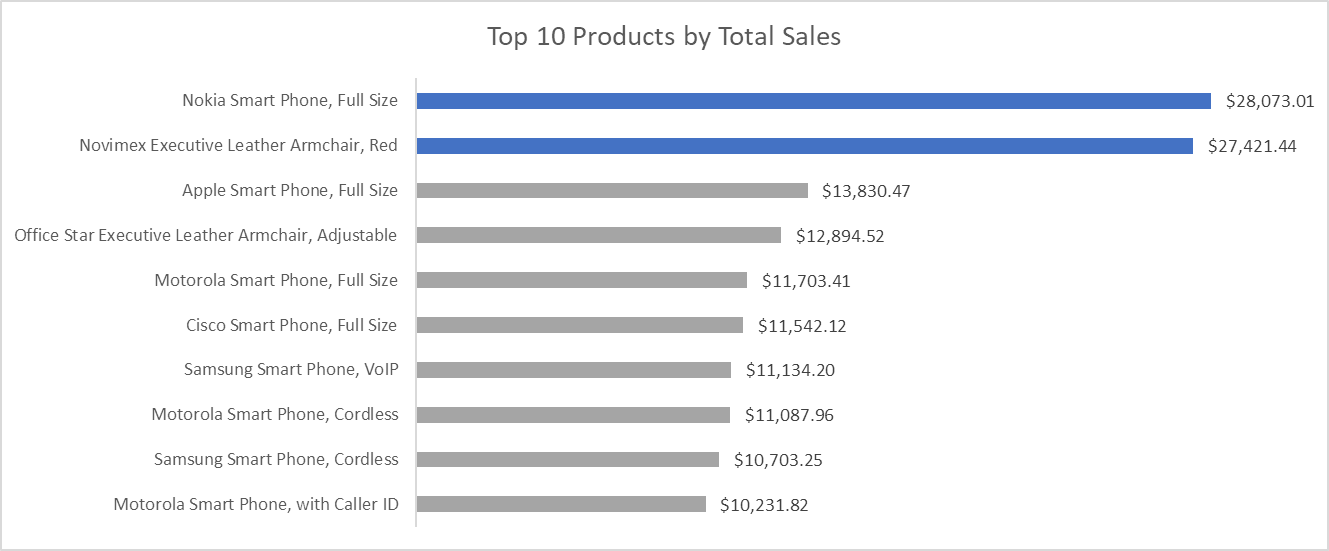
However, bar charts work best when comparing a reasonable number of categories, ideally no more than 15. Beyond that, the chart becomes cluttered, making it hard to read labels and compare values.
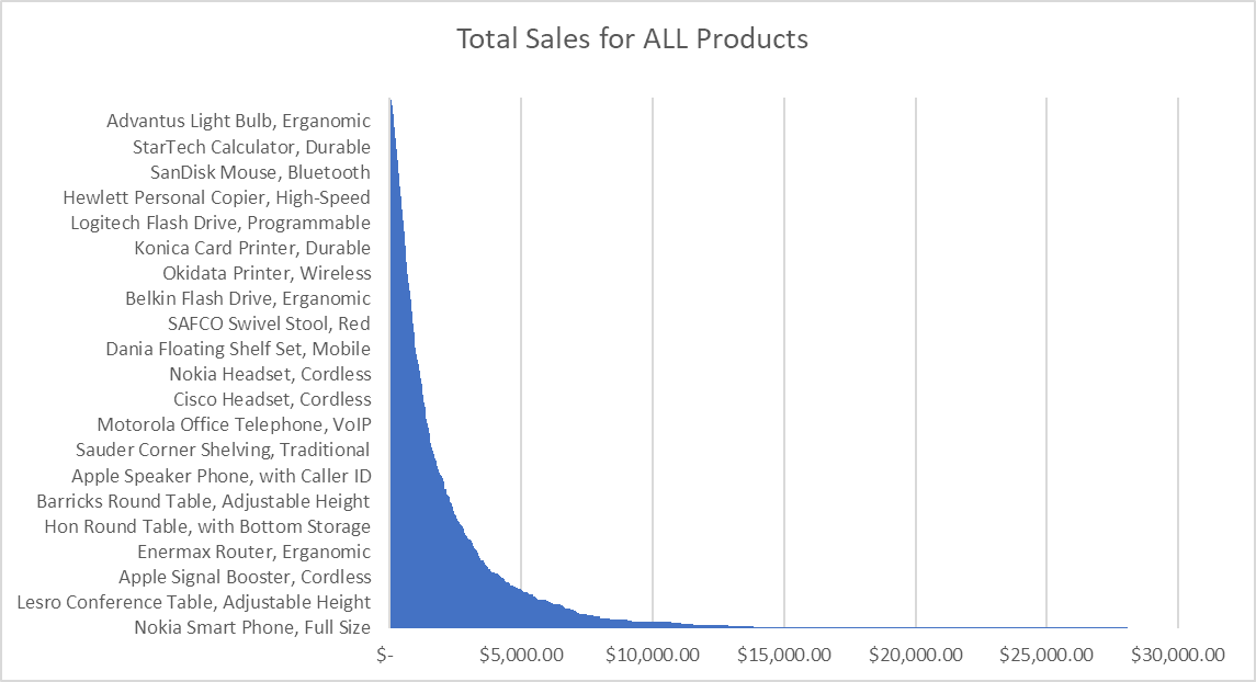
In the example below, the bars become difficult to interpret because too many categories are squeezed into the chart. The Nokia Smart Phone and the Novimex Armchair are technically the best performers, but their labels are lost in the visual noise, making it harder to draw meaningful conclusions.
❌ 
If we’re comparing discrete categories, a bar chart offers the clearest view. But if we’re exploring relationships between numeric variables or changes over time, consider a scatter plot or line chart instead.
2. Line Charts: Showing Changes Over Time

If a data question involves understanding how data changes over a continuous period, especially time, a line chart is a great visualization to use. Line charts clearly illustrate trends, patterns, or fluctuations, making it easy for viewers to track changes over time.
Answer questions like:
❔ How has [measurement] changed over [time period]?
Superstore Example:
We’re examining monthly sales data over several years and ask ourselves, “What are the trends in sales over time?” A line chart immediately reveals trends, such as periods of consistent growth or seasonal peaks and valleys. Our audience can quickly understand how sales performance has evolved, allowing us to discuss future strategies based on clearly visible patterns.
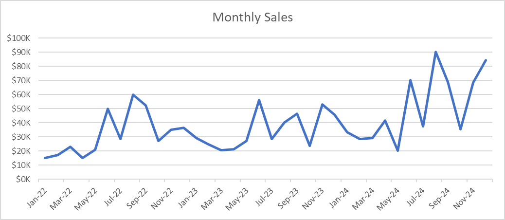
If we need to compare multiple series (for example, sales in different regions over time), we can plot multiple lines on the same chart. Just be sure to label them clearly or use a legend to avoid confusion.
However, don’t use line charts when comparing unrelated categories. Line charts imply continuity and sequential progression, which can be misleading when categories aren't naturally connected or ordered.
3. Scatter Plots: Exploring Relationships Between Numeric Variables

When we have a question about how two numeric variables relate to each other, we should immediately think of scatter plots.
How they work:
A scatter plot places each data point on a two-dimensional grid, with the variable we suspect influences the other (the independent or predictor variable) on the x-axis, and the variable we want to measure or predict (the dependent or outcome variable) on the y-axis. This setup allows us to see patterns that might not be obvious in a table of numbers. Clusters of points suggest common combinations or correlation direction and strength, while outliers draw attention to unusual cases that might need further investigation.
If we suspect a correlation or want to measure it, we can consider adding a trend line (or regression line) to highlight the relationship more clearly. We can also add a third variable by using color, size, or shape to differentiate data points—revealing even deeper insights into the data.
Answer questions like:
❔ How does [numeric variable A] relate to [numeric variable B]?
Superstore Example:
If our question is, "How does the discount percentage affect profitability?" a scatter plot clearly illustrates this relationship. Each dot represents an individual sale, revealing patterns such as higher discounts typically resulting in lower profits.
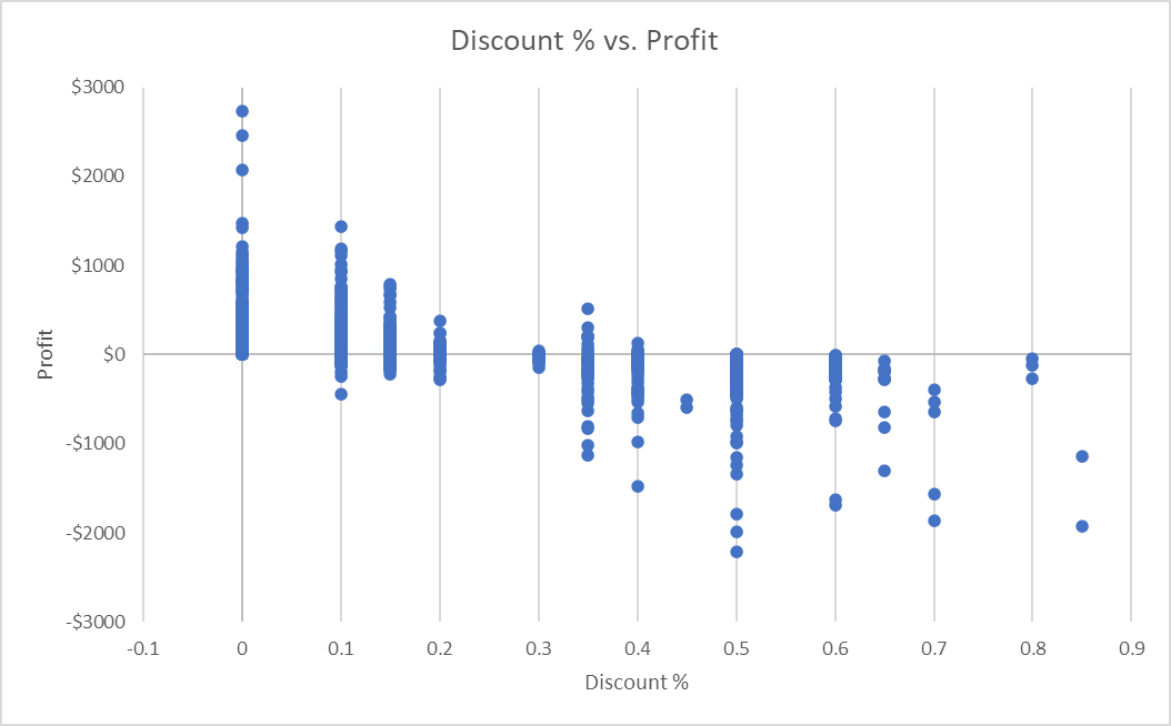
In this example, the scatter plot reveals something interesting. We see that discounts of 15% or lower maintain decent profit margins, whereas higher discounts often dip into negative territory.
This insight would be nearly impossible to spot in a data table or a simple summary statistic. The scatter plot makes it immediately visible and actionable.
4. Histograms: Understanding the Distribution of Numeric Data

Histograms are a great choice when we’re asking about the distribution or frequency of numerical data.
How they work:
Histograms group data points into ranges, or “bins,” illustrating how many data points fall into each numeric interval. By adjusting the number of bins, we can highlight broader patterns or zoom in on finer details. But be careful: too many bins can make the chart look noisy, while too few can smooth over important nuances. A good starting point is around 10 to 20 bins, depending on how much data you have. If the histogram looks too jagged or too smoothed out, try increasing or decreasing the number of bins until the pattern becomes clear.
Typically, the y-axis represents the frequency or count of data points in each bin, and the x-axis represents the numeric range.
We can also gain valuable insight into the shape of our data. A single peak might indicate a normal distribution, while multiple peaks or a strong skew could suggest deeper trends or data quality issues.
Answer questions like:
❔ What is the distribution of [numeric variable]?
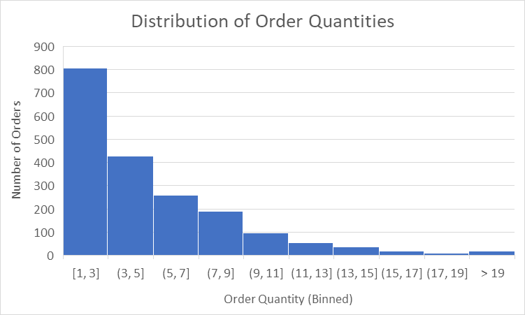
Superstore Example:
We’re looking at data on order quantities and ask ourselves, "What's the typical size of customer orders?" A histogram immediately shows that most orders contain between one and five items. This insight helps us with inventory planning: if most orders are small, stocking large bundles might not be the best strategy.
Histograms vs. Bar Charts
At first, histograms can look like bar charts, but each chart serves a different purpose. Histograms display numeric data grouped into continuous bins, which is useful when we want to see the distribution of values. In contrast, bar charts are used for categorical data, where each bar represents a separate category (such as product types or regions). Mixing them up can confuse your audience about whether the data is continuous or categorical.
5. Stacked Bar Charts: Showing Part-to-Whole Relationships

Stacked bar charts work well when you need to show how different subcategories contribute to a total. Each bar clearly represents the total value, with segments showing the contribution of each subcategory.
Answer questions like:
❔ How do subcategories contribute to each category's total?
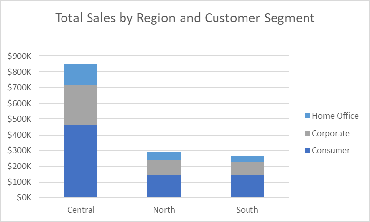
Superstore Example:
We might use a stacked bar chart to answer, "How do sales vary by region and customer segment?" This visual clearly demonstrates how regions differ and how each customer segment contributes to regional sales totals. It provides an immediate sense of proportion, highlighting the segments driving overall sales performance. At a glance we can see that the Central region drives the most sales and that the Consumer segment accounts for the largest proportion of sales for every region.
6. Pie Charts: Clearly Showing Proportions

Pie charts work well for questions about proportions because they clearly show how individual categories contribute to a total. They work best when all your categories sum to a meaningful whole (typically 100%). If our data doesn’t represent a complete set of parts, a pie chart can mislead the audience about the overall composition.
Answer questions like:
❔ What proportion of the total does each category represent?
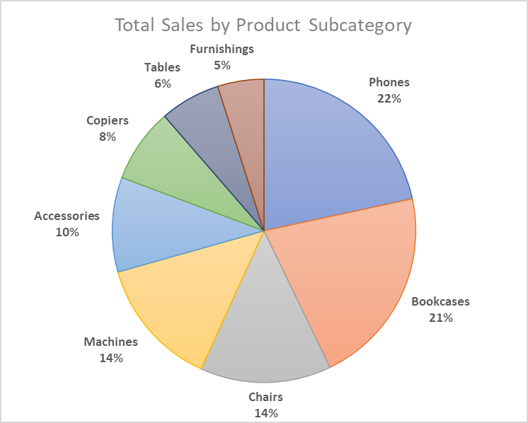
Superstore Example:
If we ask, "What proportion of total sales comes from each product category?" a pie chart effectively illustrates that categories such as phones, chairs, and bookcases dominate overall sales. The proportions are immediately clear and intuitive. We can see that phones and bookcases make up nearly half of all sales, while subcategories like tables and furnishings account for a much smaller proportion.
Pie charts are straightforward for showing a few large categories, but they become hard to interpret when you have many slices or need close comparisons. In those cases, bar charts or stacked bar charts often work better for clarity.
7. Box Plots: Highlighting Distribution and Outliers

Box plots (also known as box-and-whisker plots) are excellent for questions about comparing how data is distributed across categories. They display the median, interquartile range (the “box”), and potential outliers (the “whiskers”). By quickly showing the spread of values, box plots help us identify extremes and gauge overall consistency.
Answer questions like:
❔ How does the distribution of [numeric variable] compare across different [categories]?
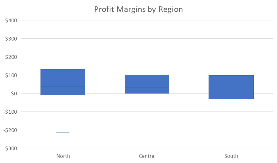
Superstore Example:
Our question is: “Do profit margins vary significantly by region, and which region has the widest spread?” Because this question focuses on comparing the distribution of a numeric variable across groups, a box plot is an ideal choice. When we look at the chart, we see that the North has profit margins ranging from around –\$200 to \$350, with a median near \$50. Central is more tightly clustered around its median, and the South shows a moderate range, with dips below zero. These differences help us identify variation, spot potential outliers, and decide where to investigate further.
Box plots are powerful for comparing distributions across multiple groups. However, if your audience isn’t accustomed to them, provide a brief explanation or opt for histograms when showing a single numeric distribution.
Review
Choosing the right visualization always begins by clearly defining the question you're trying to answer. Different questions naturally lead to different chart types, and clearly matching your visualization to your question is essential for effective communication.
With practice, selecting the right visualization will become second nature. You'll feel confident knowing you're clearly communicating your data insights, making your visuals easy for any audience to understand and act upon.